Context
A new platform, on a system the old one still depended on.
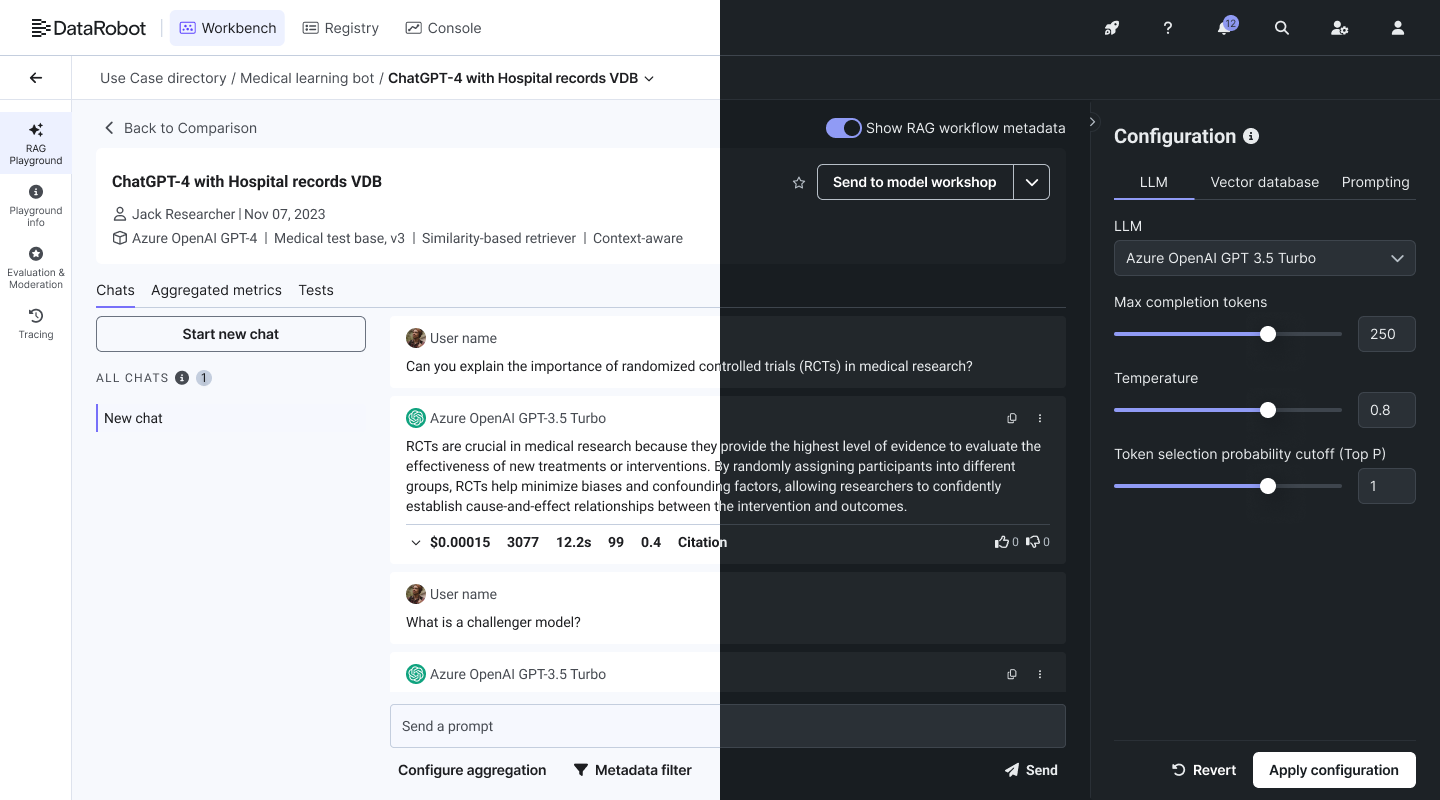
The company was growing, and a strategy shift meant building a new product architecture. That was the moment to modernize both the look and the experience: new color, typography and iconography, and patterns built for what the product was becoming.
The catch was that we couldn’t start from scratch. The existing system was old but extensive, and the classic platform depended on it. A clean rebuild would have been easier to design, but it would have broken a product customers were using every day.
A rebuild was off the table: the engineering cost was too high, and the system was too mature to throw away. So the constraint became the strategy. I evolved the system through new themes on the existing core, which let the new platform be built in parallel instead of waiting for a new system, and let teams already shipping features get components as they needed them.
My role
One library, one decision-maker, two platforms.
- I owned: the Figma library, every decision on how components were built and documented, the token architecture, and the link between design and engineering.
- I influenced: what to build next, through the shared backlog and recurring syncs with designers and engineers.
Understand before changing
Things in an old system often look wrong for a reason.
Audit. I reviewed every colour, style and pattern, and found duplicates and overlapping components that had built up over the years. Before changing anything, we traced it back to why it existed.
Listen. I surveyed ~10 designers about their pains and gains, including how they experienced our Figma files, and worked with engineers on what was failing in code. The problems fell into four kinds:
- Figma: components that had to be detached to work.
- Product: components that no longer covered what the product needed.
- Engineering: legacy code too heavy to perform well.
- Documentation: written for engineers, with no guidance for designers on which component to use when.
This gave us a short priority list, each item with a reason behind it.
Key decisions
Every change had to be safe for both platforms.
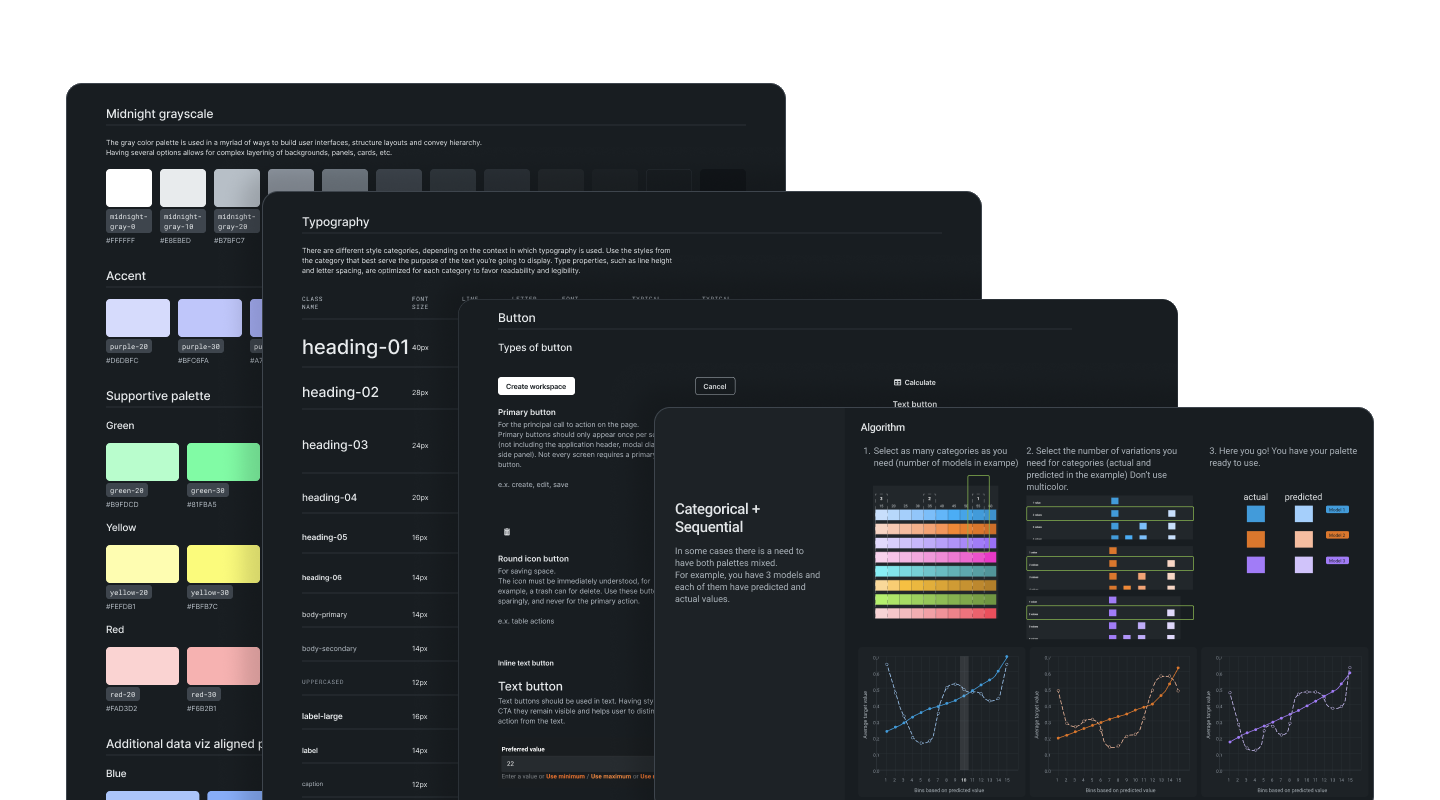
Evolve the foundation, don’t replace it. The new visual language arrived only through themes, so nothing in the classic platform had to change. Trade-off: we carried some legacy structure forward. Win: no breaking changes.

Deprecate, build or share. Each of the system’s ~50 components took one of three paths. Some were deprecated, and some were built new (the table, navigation, chat and drawer; chat came out of the GenAI work). The rest were shared by both platforms, like the date picker, and those carried the most risk: every change to them had to be checked against both platforms.
Fix where the problem lives. Figma issues I fixed in the library. Product needs went to engineering as concrete capability requests. When a component worked but its code was heavy, we rebuilt it anyway while the work was already open.
Shared navigation for a product built in silos. The platform had grown as isolated areas with their own patterns. We designed a shared sidebar and layout and tested every area’s needs against it, because this one change touched the whole platform.

A pattern for complex flows. Nested flows, such as creating one object while in the middle of creating another, had outgrown our patterns. We didn’t just cover them; we questioned whether they could be simpler. The result was a drawer component, now used widely across the Predictive ML and Data areas.
Foundations
Accessible from the start, and named the same in design and code.
- Tokens from zero. The system had none, only years of near-duplicate colours. I introduced a token architecture with one naming pattern for design and code.
- Accessibility as a gate, not a review. AA was required before a component shipped, and an external audit later confirmed it.

- Documentation for the people choosing, not just building. The old docs were written for engineers. The new ones told designers which component to use and when, with content rules co-written with the language team.
Deep dive
The table: from expanding rows to master–detail.
The hardest component: sorting, filtering, drag and drop, pinned row actions, and a lot of progressive disclosure through expandable rows.
Expanding rows didn’t scale. Rows grew tall, context got lost, and density suffered. Through workshops with designers and engineers, we changed the pattern itself to a master–detail view: the table stays scannable, and details open alongside it. The hardest part was defining hover versus selected versus diving into a row, so the table behaves the same everywhere.
Not every redesign wins. For filtering, I expected a new pattern to beat the existing one. I built two prototypes, current and redesigned, and ran an unmoderated usability test with internal users on the same filtering tasks. People filtered more slowly with the redesign, so we kept the existing pattern. The system changed where the evidence said it should, not where it looked newer.
Try the component
Below is an interactive rebuild of the table, showing the behaviours the system had to get right: sorting, a filter builder, column resize, reorder, pinning, and the hover versus selected states we had to pin down. Open Columns in the top right, build a filter, drag a header, or pin one from its menu.
This isn’t the shipped product. I rebuilt a reduced version of the table from scratch for this portfolio, with its own generated sample data (model monitoring) and a smaller feature set. It shows the behaviour and states, not the exact screens.
The prototype works on larger screens.
It’s built for a desktop browser, like the tools it illustrates. Open this page on a laptop or desktop to try it.
Leading the system
Run as a product, with a backlog the whole team agreed on.
I owned the Figma library and every decision on how components were built and documented. Designers brought input; I made the call on how components were built. What to build next, we decided together. I was also the single point of contact between design and engineering. Auditing every instance of each component across the platform made me one of the few people who knew the whole product end to end.
To make the system outlast the six months, we kept a standing backlog and ran two recurring syncs, one with designers and one with engineers, where anyone could propose a pattern. At a team offsite I shared Figma usage and detach statistics, and we mapped every candidate on impact × effort with stickers on a wall. The result was a backlog the whole team had agreed on, not one I had handed them.

What changed
One system, two platforms, nothing broken.
- One system, two platforms: the new platform built on new themes while the classic one kept running.
- Tokens where there were none: one architecture and naming pattern, shared by design and code.
- Adoption enforced in code: the core team reviewed every PR against the system and blocked those that bypassed it, so engineers adopted it first.
- No breaking changes: issues that came up were small tweaks and missing cases, fixed quickly.
- New platform-wide patterns: navigation, the drawer, chat, and the master–detail table.
- A governance loop: a shared backlog and recurring syncs kept the system improving after the dedicated phase.

Reflection
Treat design–code sync as infrastructure, and AI as the newest consumer.
What I’d do differently. Design and code still drifted. Without today’s MCP-style tooling, alignment depended on discipline. Now I’d treat sync as infrastructure: token pipelines and code-connected components.
What comes next. Since then, engineers have started building with tools like Cursor and Claude Code on top of the system, which makes AI its newest consumer. The next iteration has to be AI-friendly, with machine-readable documentation and code tied to the repository. That would also close the drift gap. AI also brings new patterns, such as chat, citations and streaming. For each one, the question is the one every component faced: share an existing one, or build something new?